Accessibility
& the Design System
Qualtrics
I led accessibility initiatives for our Design System team at Qualtrics. We made great progress on meeting high accessibility standards across the application, and achieved the very high standard of WCAG 2.1 AA for certain key flows.
The path to WCAG 2.1 AA
A strong accessibility initiative was vital to securing over $10m in pending contracts, and opens up millions more as requirements for greater accessibility come in from around the globe. It’s also incredibly important to make sure that your product works well for as broad a set of people as possible, and I can help make the product better for everyone.
We already met many of the requirements for 2.0 AA, and was the design lead on a team effort to bring us in line with 2.1 AA.
I’ll highlight the effort with two examples:
Designing for contrast
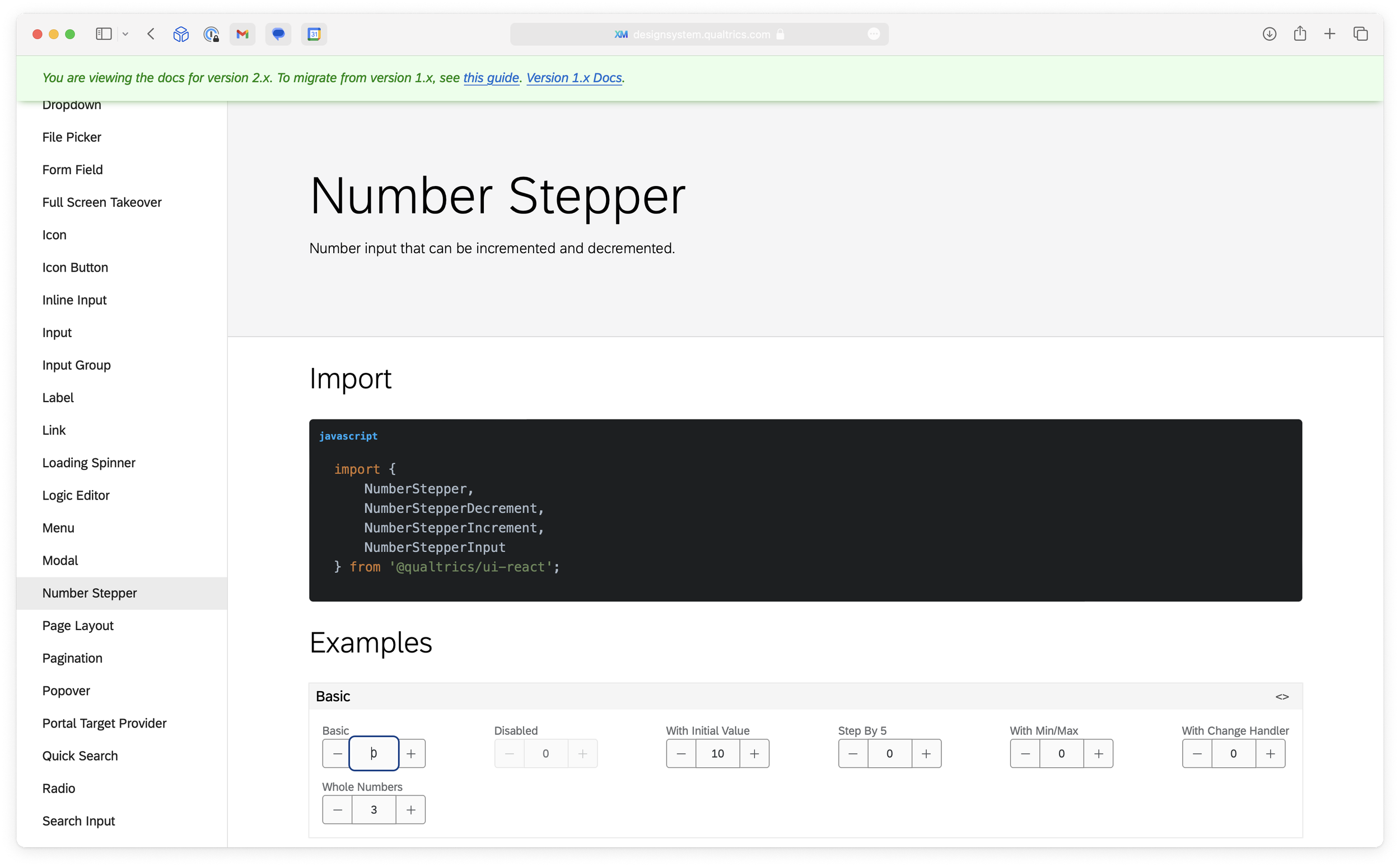
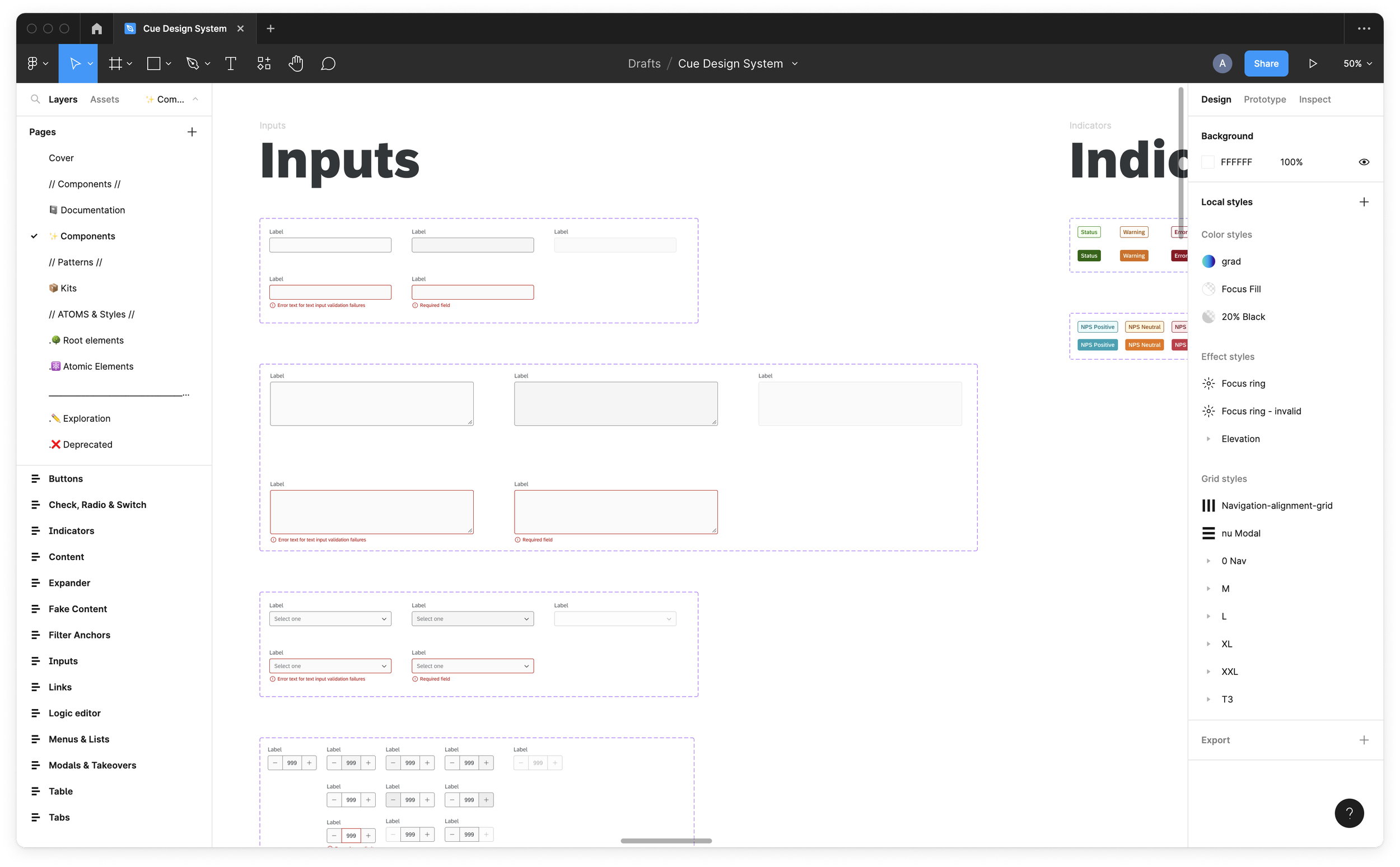
Prior to my work to align us with 1.4.11: Non-text Contrast (Level AA), many of our components were light grey and borderless. This design worked fine for people without low vision, but was a huge issue for folks with visual impairments
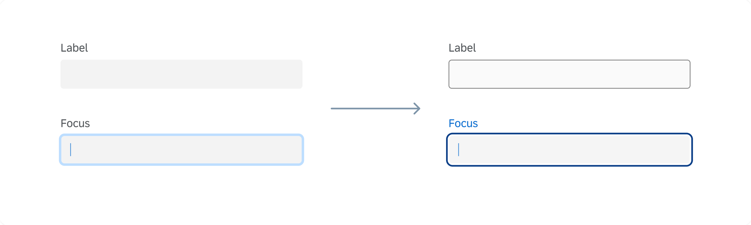
I updated every component in our Figma Library, and I worked closely with the engineering team to make sure that our React Library was updated quickly as well.
Designing for very small screens
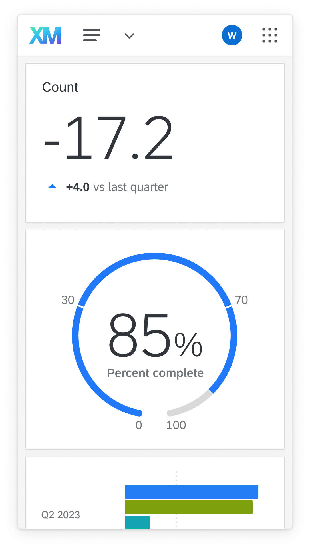
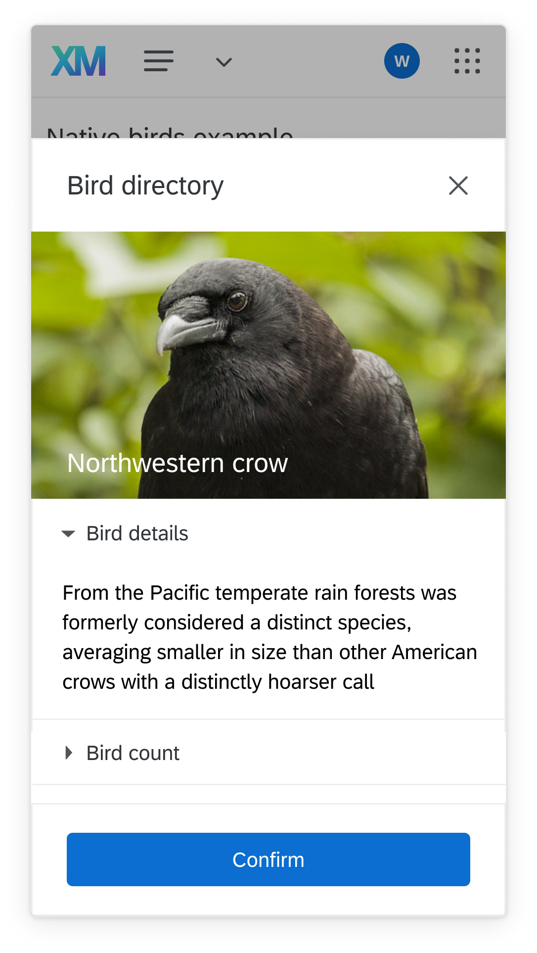
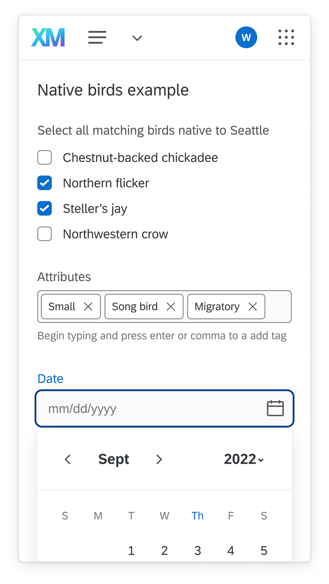
1.4.10:Reflow (Level AA) is by far the largest single project for the Qualtrics design team. In short, every screen must work in a window 320px wide “without loss of information or functionality”. This is no small task for a complex SaaS product well over a decade old.
Setting designers up for success requires up to date tools and education. So far, I have:
Run small group workshops with every member of the Design team.
Met 1:1 with dozens of designers, PMs, and Engineers for crits, reviews or brainstorming.
Redesigned problematic components.
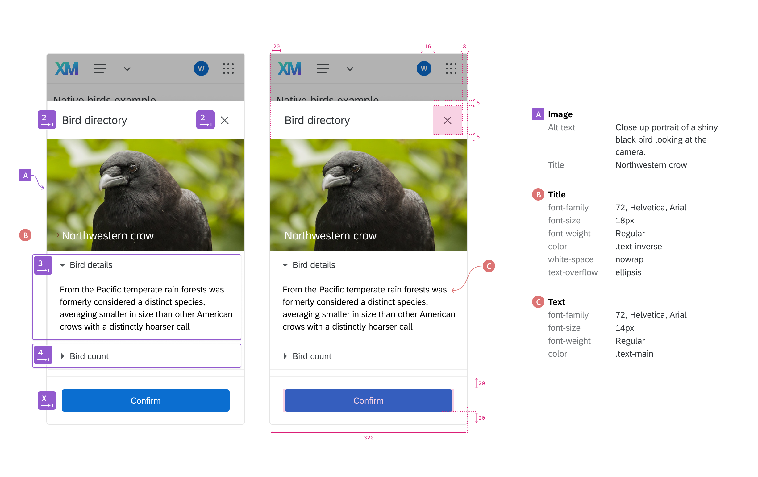
Built a spec library so designers have smoother responsive handoffs.
Accessibility specs
To encourage the smoothest transition between design and engineering, a full set of spec components have been designed and componentized. They cover everything from our default measurements, to ARIA labels, to easy to configure page widths (highlighting the 320px requirement).
Specs include components to help define:
Page regions
Tab index
Keyboard arrow navigation
Standard and custom measurements
Standard and custom component spec tables
Data Components
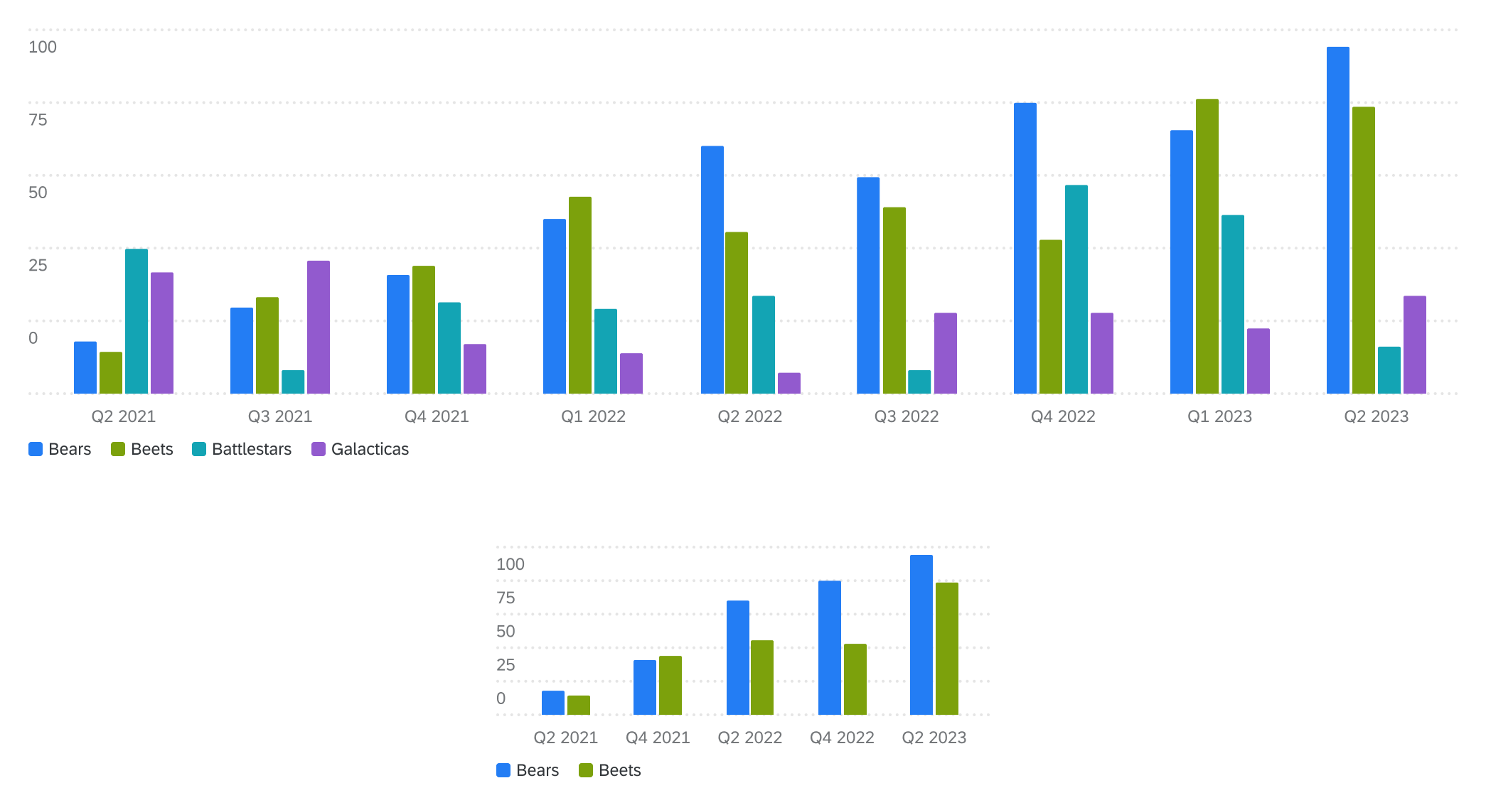
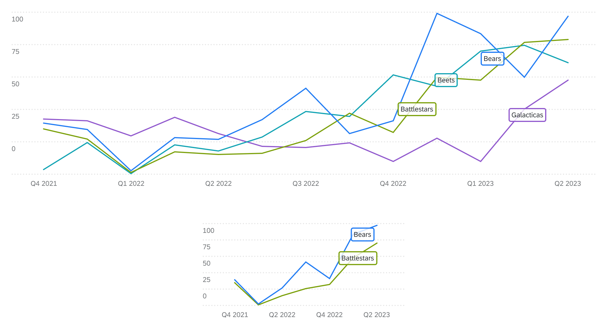
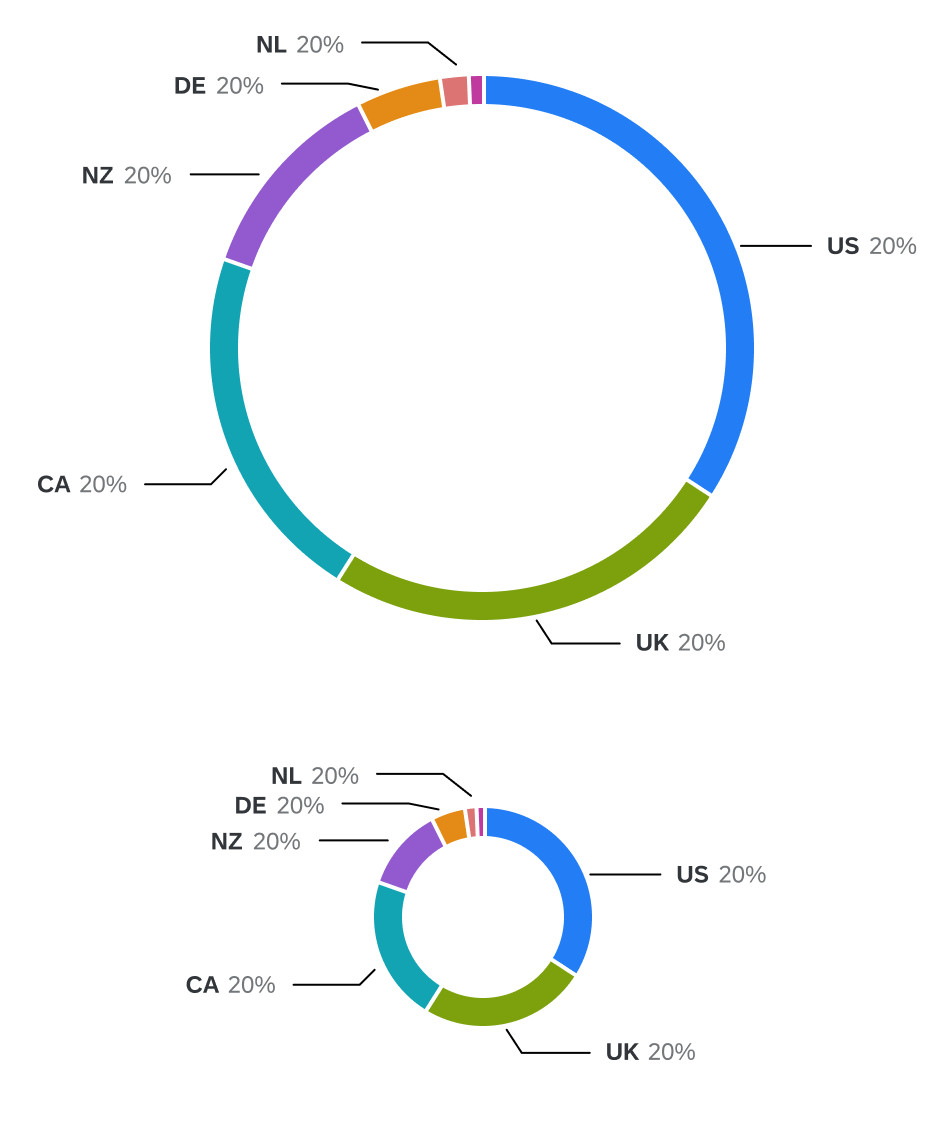
Data is displayed on so many pages in so many ways, charts had to be a key part of the design system. I have created a set of extremely customizable, full resizable components for all out major chart types.