Designing for Agents
Surfboard
I wore multiple hats at Surfboard: design, engineer, product. We were a small team, racing ahead of the giants, trying to build something while there was still space. In the end, we built something great and useful, it just wasn’t enough.
What is Surfboard?
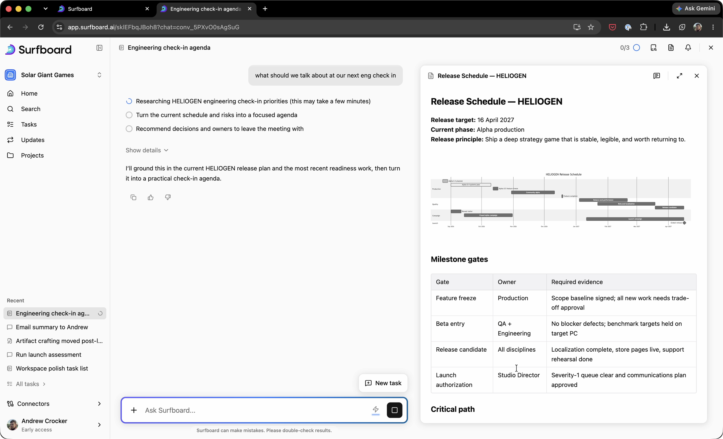
“An AI tool for knowledge workers” is how we described it, even though it’s broad enough to be basically meaningless. We wanted to be a central hub for an organization’s processes and information. The first place users would go if they needed to ask a late-night benefits question, or run a board meeting.
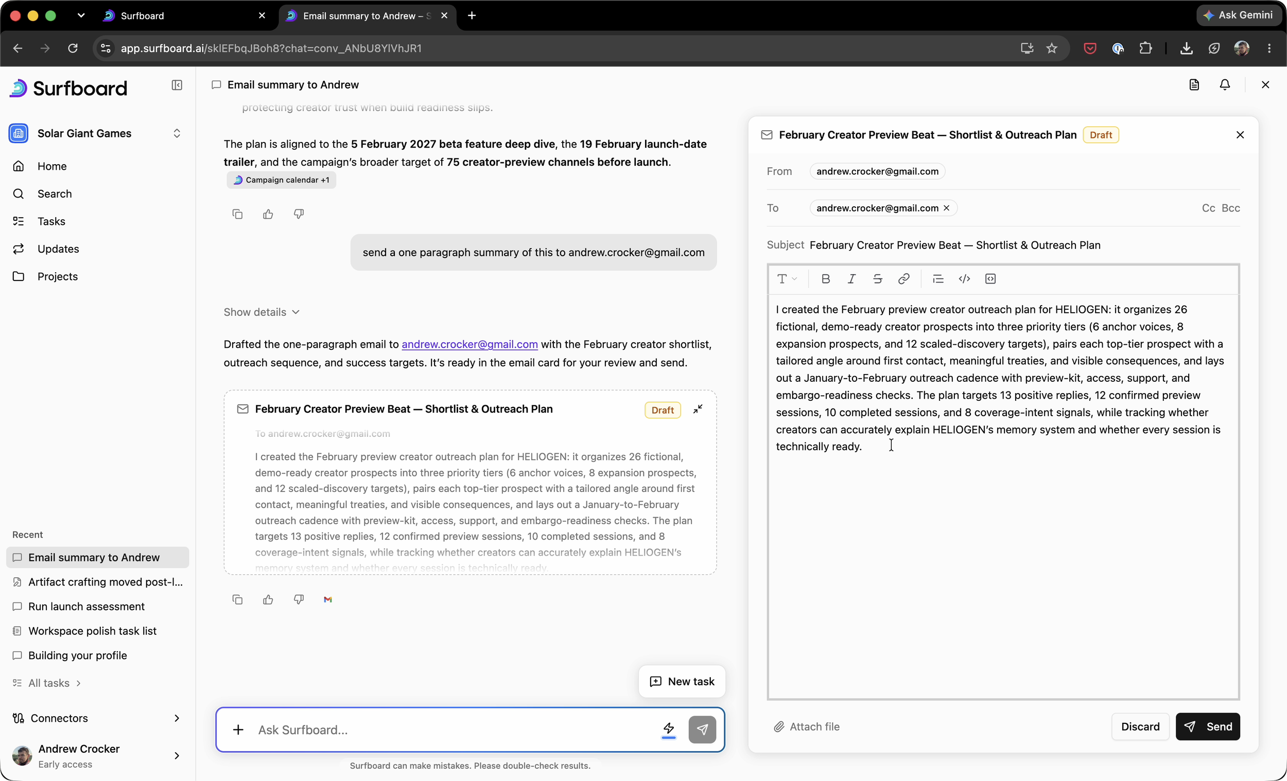
It was Cowork - launched before Cowork - but web based and multiplayer. Able to build off a whole org’s shared memory, not just yours.
IA Evolution
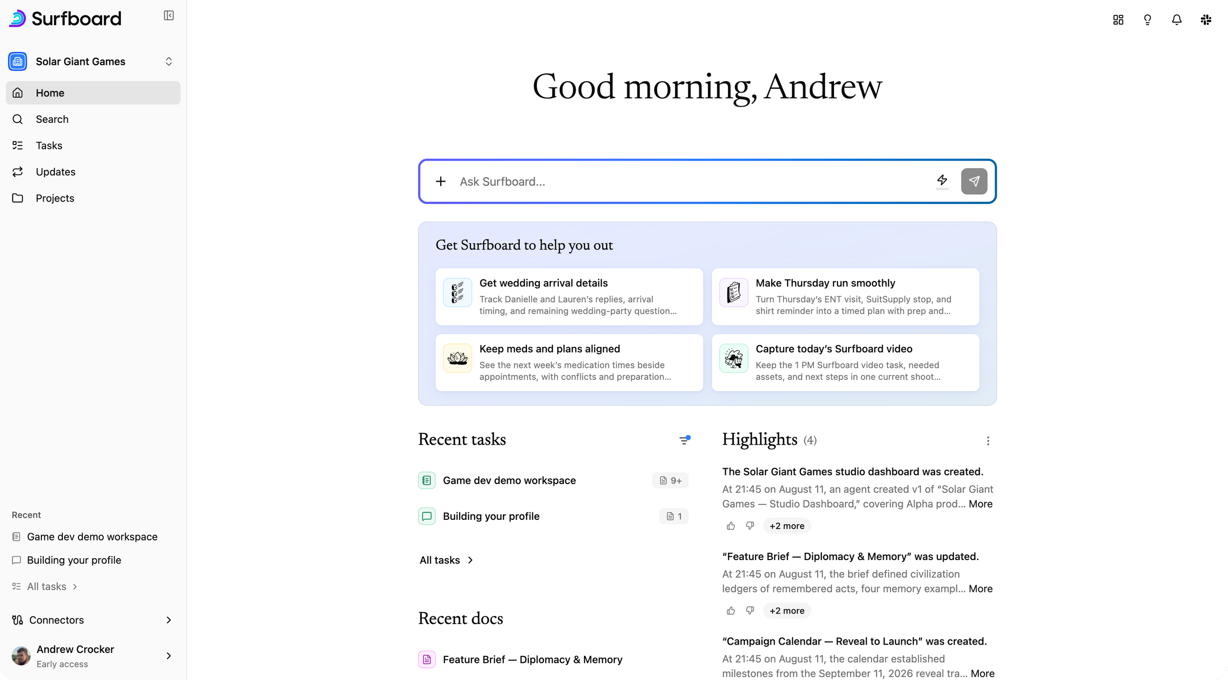
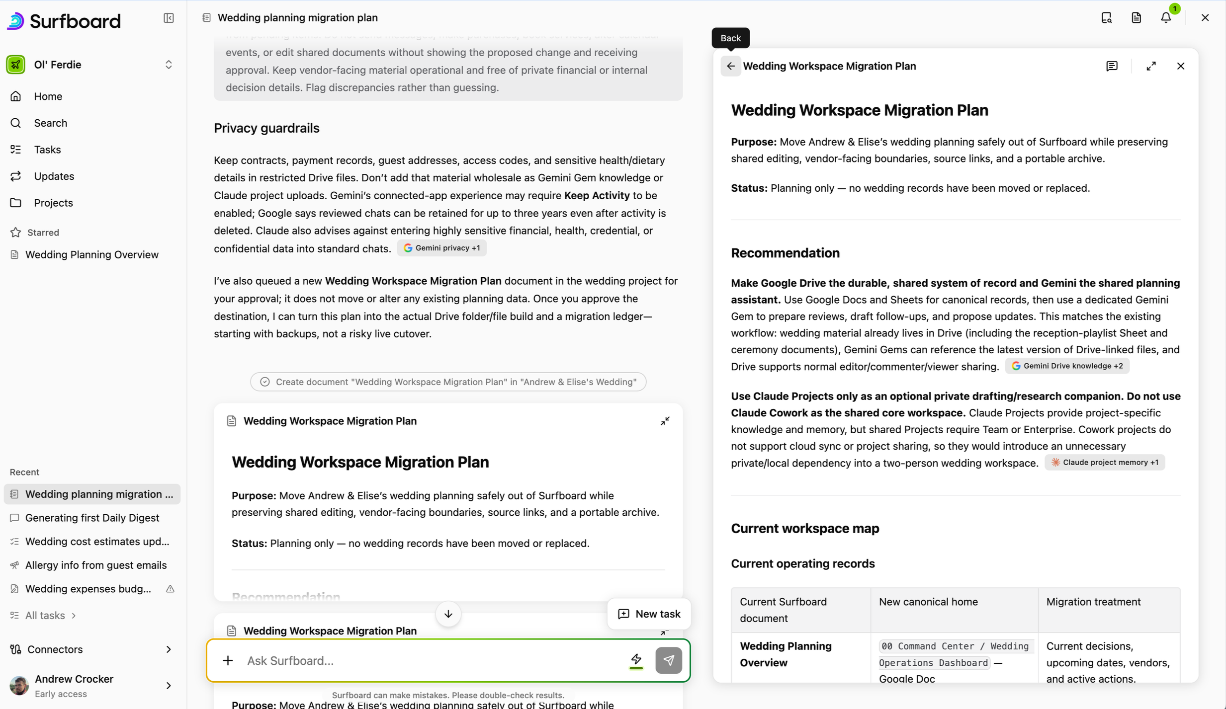
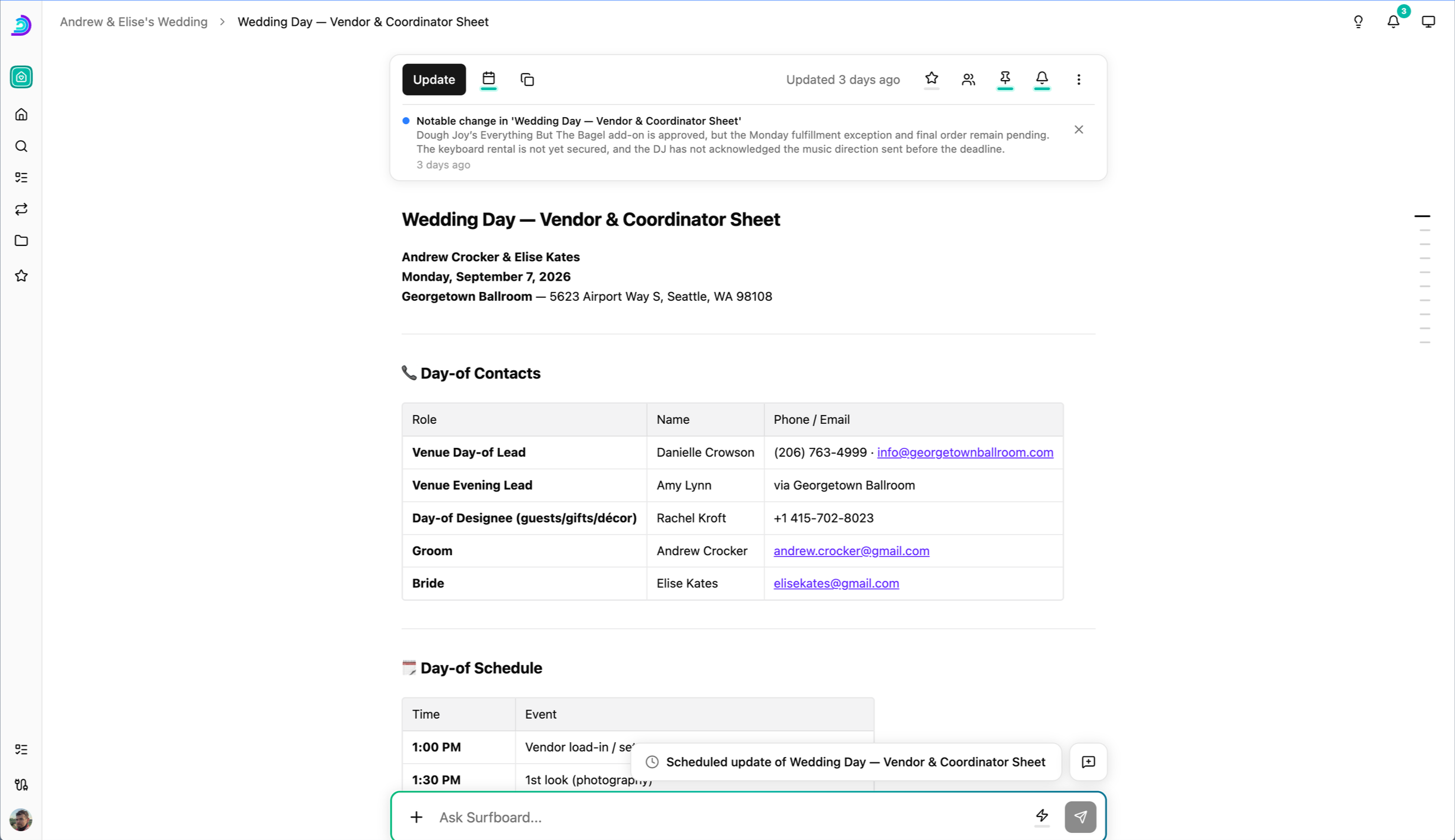
Our hypothesis was originally that users would have multiple different workspaces that they were members of; that each team would have different permissions, connectors, and file structures. This lead us to build a product that focused more on file management than solving user’s problems.
The introduction of Flows marked a shift: Surfboard was more about what it could do with the data than the data itself. Our approach flows gave users one-click access to any complex workflow the user could think of:
Prepare a user for a meeting based on a very specific, very personal set of requirements.
Build a document based on a couple rough notes. With posthog, zendesk, slack, Google Docs etc, it’s possible to build a well sourced PRD in a clear repeatable, consistent format.
Watch for and trigger notifications as requests come in, with drafts for resolutions already there.
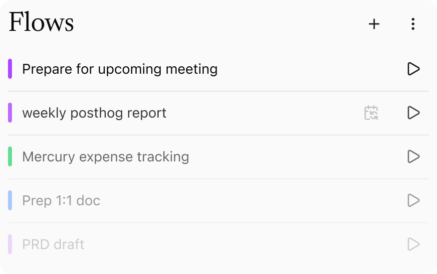
So, our original hypothesis on workspaces was wrong. Our users were more interested in functionality similar to flows, and less on managing documents across tightly siloed workspaces.
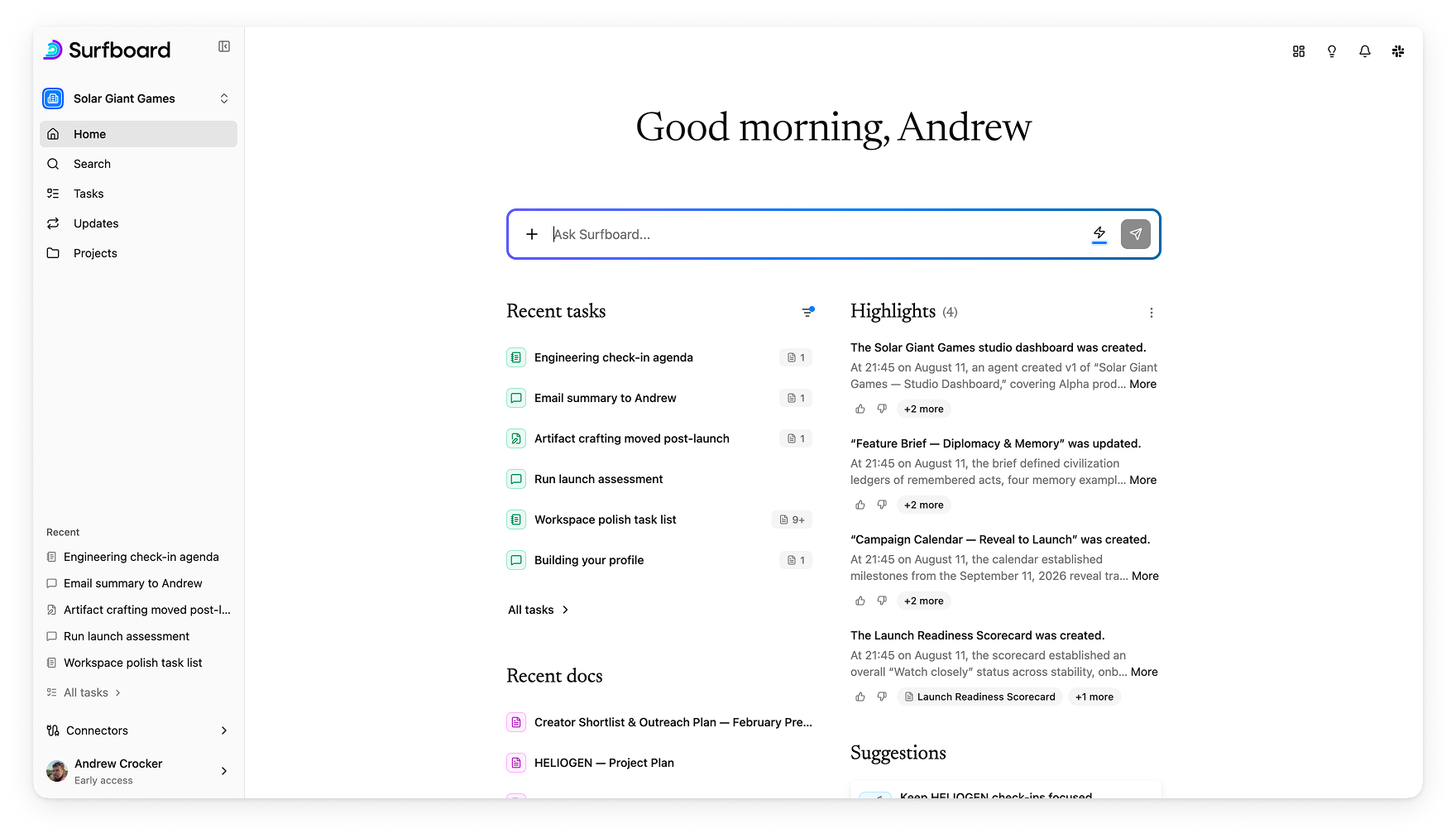
So we reoriented around a few simple tasks
Find anything. Better, universal search across all connectors, and quick answers to one-off questions
What’s happening today. For me or for my whole organization
Repeated actions. Any scheduled task that we can automate for users
Appendix:
Interaction details
At a startup, sometimes you spend time focusing on the big headline features. But often it’s the little details that end up having the most impact:
Wayfinding and character
Problems:
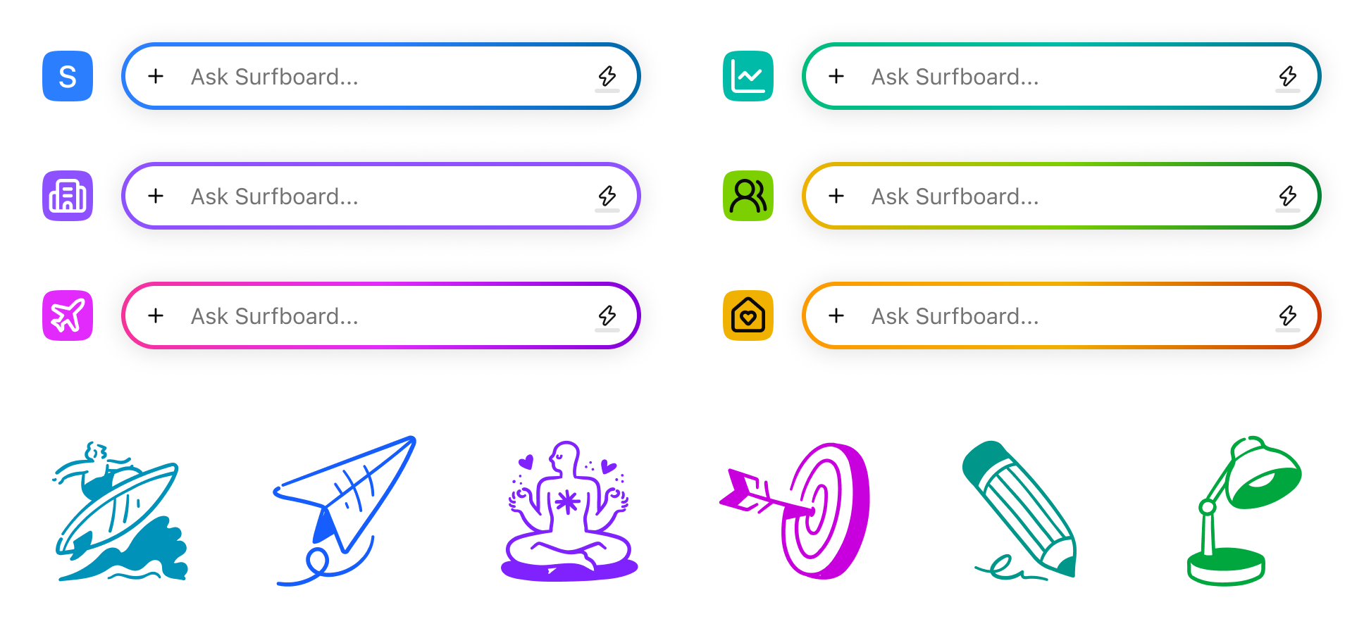
Surfboard felt sterile and cold with off the shelf shadcn components.
Minimal wayfinding. Users were lost, often unclear about what workspace they were in, which could lead to data leaking across workspaces.

Solutions:
Color and icons to add personalization and wayfinding.
Large, clear serif typefaces for sections.
A language pass for voice and tone. Guidelines were set in the claude.md file, and personally handled key, high traffic titles and actions.
Toggle buttons
Problems:
The normal pattern for icon buttons is to add a background shade or change the icon to indicate state.
Both approaches can be ambiguous, and confused with :hover or :active states. Even experienced users may have to toggle them or click in to see state.
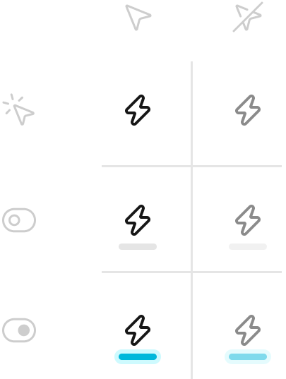
Solution:
Toggleable buttons all have a consistent ‘indicator light’. This indicates affordance and state, in one clean themeable object.
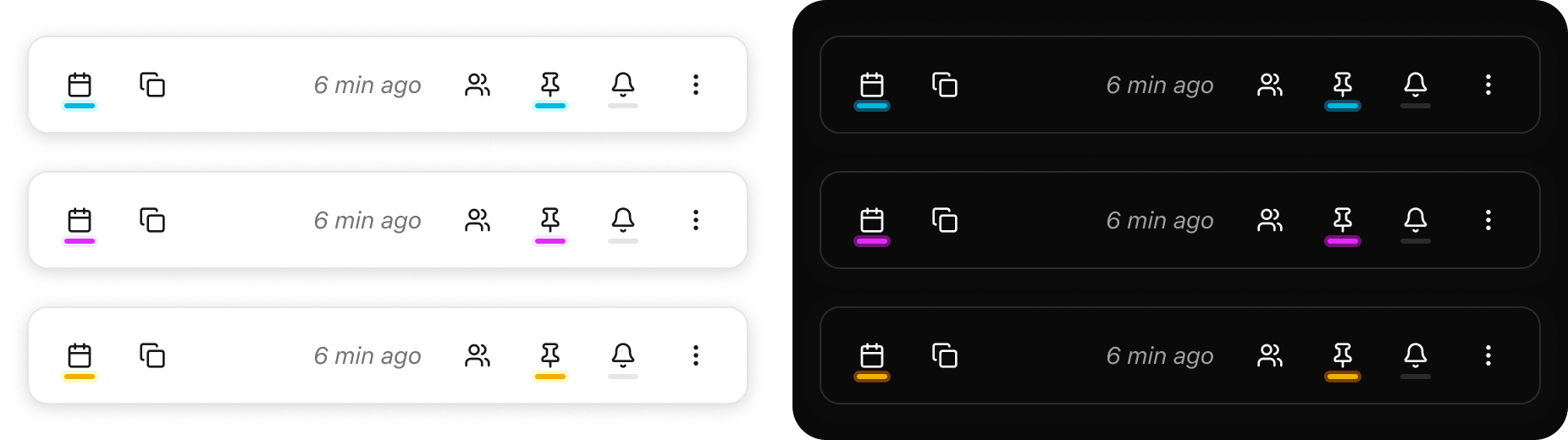
Document & Chat elevation model
Problems:
Users had some issues telling documents and chats apart at a quick glance.
Both had a set of icon buttons, persistent chat interface floating at the bottom.
Especially early on; they were just sibling columns next to each other, without clear separate designs or reserved space.
Solutions:
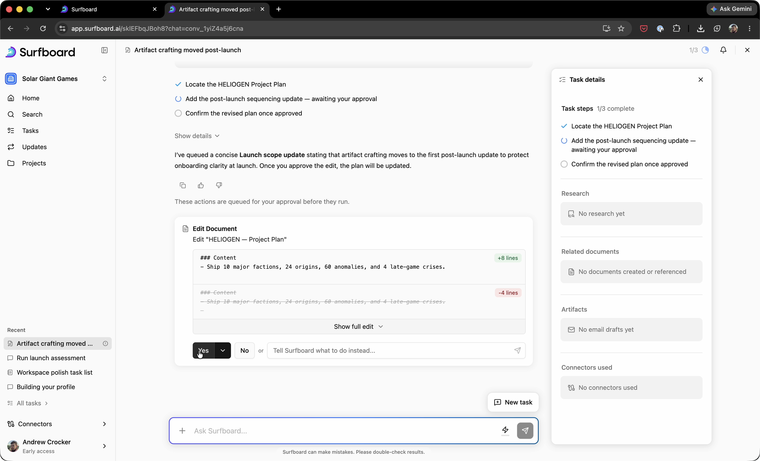
A consistent elevation model and differentiated design solved the problem.
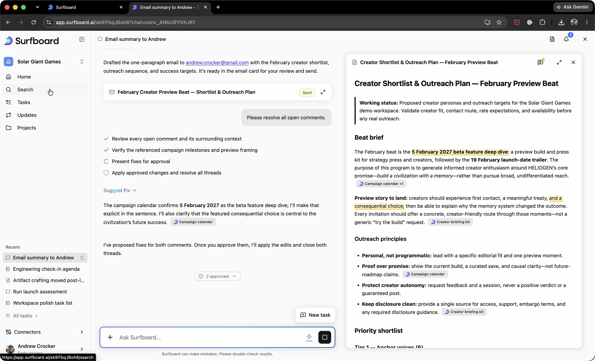
Chat for a slightly more open line height and narrow line widths, ideal for skimming short replies.
Full screen chat was always E0, and could contain E1 items on it that almost always related to documents or artifacts.
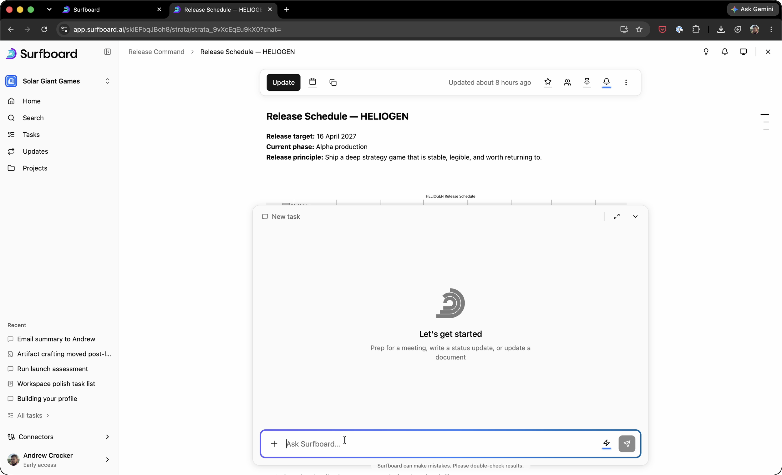
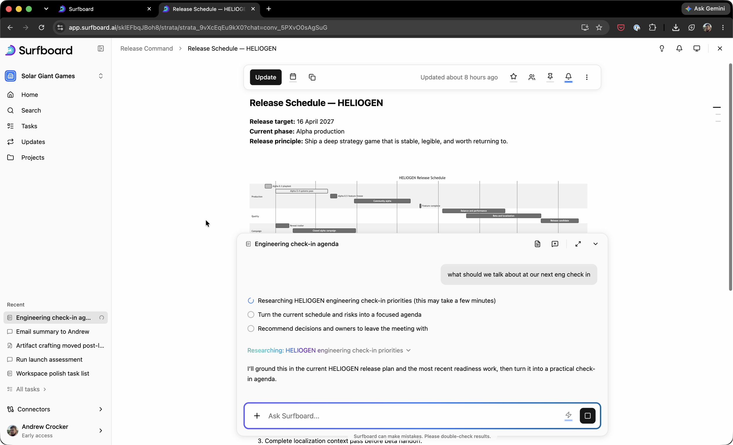
A clean and universal pattern for flowing between full screen and mixed screens was implemented everywhere.